
Reporting takes too long
Time is spent collecting, checking and rebuilding information instead of using it to understand performance and make decisions.
Helping businesses make sense of their data.
I help organisations improve reporting, automate manual processes and make important information easier to understand, monitor and use.
Independent data consultancy based in Jersey, working with organisations locally and further afield.
Good reporting isn’t about adding more dashboards. It’s about bringing the right information together, making it reliable and giving people something they can actually use.

A little about me
I’m Paul Burrows, an independent data and reporting consultant based in Jersey. I help organisations turn complicated, disconnected or time-consuming information into reporting and processes that are clearer, more reliable and genuinely useful.
I work directly with the people who understand the problem, combining practical business experience with hands-on delivery.
More about meReporting needs to be useful, efficient to produce and reliable.
Most organisations already have the information they need. The challenge is bringing it together in a way that makes important issues visible and gives people information they can trust, understand and use.
Time is spent collecting, checking and rebuilding information instead of using it to understand performance and make decisions.
Risk, compliance and operational information often sits across different teams, systems and spreadsheets. Bringing it together makes exceptions, overdue actions and emerging problems easier to identify.
Regulatory reporting, governance and stakeholder expectations require information that is accurate, consistent and available when it matters.
Practical support for reporting, risk, regulation and data processes.
I work directly with clients, taking the time to understand the challenge before deciding what to build. The aim is to find a practical starting point, deliver something useful quickly and refine it with the people who will actually use it.
Bring information together in a clear, accessible way so people can explore performance, identify what is driving it and make informed decisions.
Bring regulatory, risk and control information together so teams can see what needs attention, understand where problems are emerging and manage reporting requirements with greater confidence.
Reduce repetitive work by improving how information is prepared, checked, moved and reused.
Technology & capability
The business need comes first. The technology comes second.
I work across reporting, data preparation, automation and process improvement, choosing the right combination of tools for the job rather than forcing every requirement into the same solution.
Explore practical examples of reporting and analysis across different business areas.
Workforce reporting
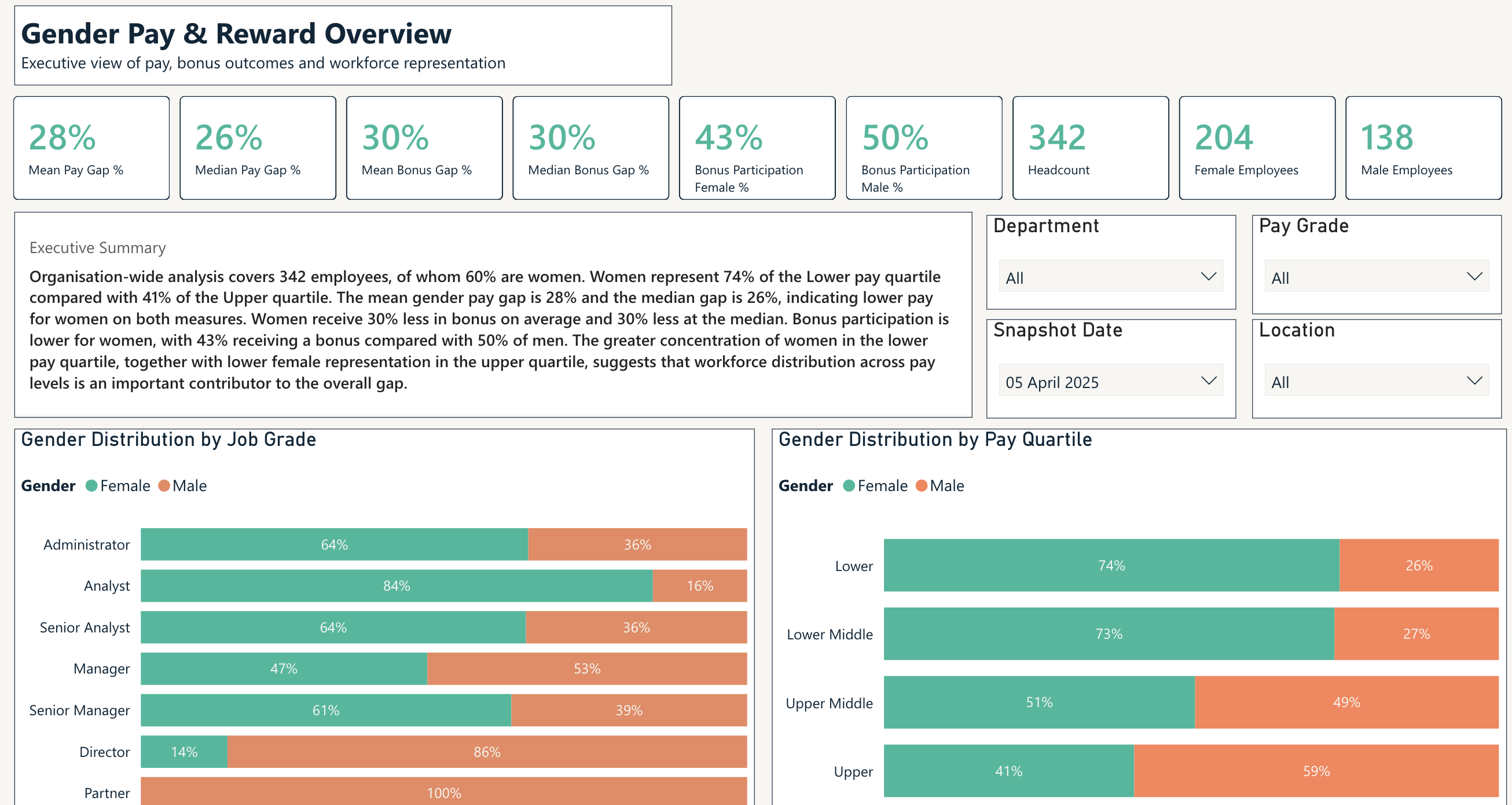
Bring payroll, bonus and workforce information together so decision makers can understand what is driving the gender pay gap rather than reviewing one figure in isolation.
Explore the case studyAll demonstration dashboards use synthetic data and fictional organisations. No real client, employee or patient information is shown.
Start with a conversation
Tell me what you are trying to achieve, where the current approach is creating difficulty and what better would look like. I’ll give you an honest view of where I can help and what a sensible starting point might be.